
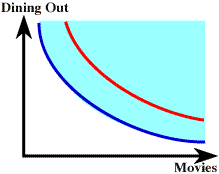
 Here is part of an indifference map for some consumer. The light
blue shaded area indicates bundles that yield greater levels of
satisfaction than on the blue curve. Points above and to the right
(to the northeast) will always yield greater satisfaction or utility.
So, any point on the red curve will be more desirable or yield
greater utility for our consumer than any point on the blue curve.
Here is part of an indifference map for some consumer. The light
blue shaded area indicates bundles that yield greater levels of
satisfaction than on the blue curve. Points above and to the right
(to the northeast) will always yield greater satisfaction or utility.
So, any point on the red curve will be more desirable or yield
greater utility for our consumer than any point on the blue curve. 