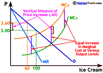
There is a lot going on in the graph to the right, but we only need to focus on two things since we've seen most of this graph before. First, note that the purple lines labeled Equal Increase in Marginal Cost at Various Output Levels are all the same length. This is because ice cream producers do not use enough extra milk fat when they increase ice cream production in the short run to change the market demand for milk fat and drive up the price. Thus, MC1 and MC2 are the same vertical distance apart at every point (even though it looks like they are getting closer as we go to the right).
Second, note that the brown brackets labeled Vertical Distance of Price Increase (.60) is not nearly has long as the distance between MC1 and MC2. So, even though price rose, it rose by much less than the increase in marginal cost.