Measures of Distributional Inequality

The Lorenz curve is a graphical device used to represent distributional inequality. The Gini coefficient is a numerical measure of inequality based on the Lorenz curve. These measures can be used to represent any sort of distributional inequity. (Our discussion here is based on the distribution of wealth, but income distribution may be represented using these same tools.)
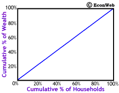
To the right is the basic setup for a Lorenz curve graph. Along the horizontal axis we measure the Cumulative Percent of Households (poorest to richest). This means that at the 20% mark would be the poorest 20% of households, 60% would be the poorest 60%. The wealthiest 20% of households would be those to the right of the 80% mark. Along the vertical axis we measure the Cumulative Percent of Wealth. So, at the 20% mark is 20% of total wealth held by the population and at the 60% mark 60% of wealth.
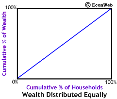
The diagonal line represents exact equality in wealth distribution. Along that line, as shown to the left, the poorest 10% of the wealth is owned by the poorest 10% of the households, 50% of the wealth is owned by the poorest 50%, and finally 80% of the wealth is in owned by the poorest 80%. This would also mean that the richest 20% only own 20% of the wealth, making them no different from the poorest 20%. As we'll see below, when wealth is distributed unequally (as it always is) the line curves downward, below the diagonal. The greater the inequality, the more the line curves away from the diagonal.
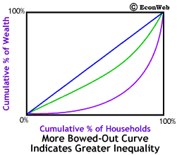
The more bowed out purple line represents greater inequality in the distribution of wealth. The less bowed out green line represents a less unequal distribution of wealth. In fact, wealth distribution in the U.S. is more unequal than that shown by the purple line.
The purple line represents a society where the poorest 30% own only 2% of the wealth, while in the society represented by the green line, the poorest 30% own 20% of the wealth. When we look at the poorest 70% they only own 20% of the wealth, while in the society represented by the green line, the poorest 70% own 50% of the wealth. Finally, the poorest 90% own only 50% of the wealth, while in the society represented by the green line, the poorest 90% own 70% of the wealth. Thus, in the society represented by the purple line, the richest 10% of the households own half of all the nation's wealth. (Again, keep in mind, that the wealth distribution in the U.S. is even more unequal than this.)
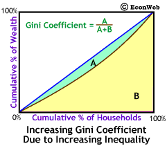
The Gini coefficient is a numerical measure of distributional inequality. The idea behind the Gini coefficient is fairly simple. We've labeled the area between the Lorenz curve and the diagonal line area A and the remaining area under the diagonal to the right of and below the Lorenz curve area B. As wealth distribution becomes more unequal the Lorenz curve bows out more and area A becomes larger and area B becomes smaller. The Gini coefficient is defined as:
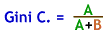
The Gini coefficient can take values between 0 and 1. If the Gini coefficient = 0, wealth is distributed exactly equally. If the Gini coefficient = 1, all wealth is owned by a single individual. Thus, larger Gini coefficients mean greater inequality.
Click here to return to The Rich Get Richer, and Buy Mansions article.
Copyright © 1995-2003 OnLineTexts.com, Inc. - All Rights Reserved