We start with a simple individual demand relationship for some student's monthly demand for small pizzas. The data given in the table to the right tells us our hypothetical student won't buy any pizzas when the price is 10. When the price is 9 she will buy 2, while at a price of 7 she will buy 6 per month, and so on. This relationship is plotted in the graph titled A Demand Curve for Pizza with Price (P) on the vertical axis and Quantity (Q) on the horizontal axis.
| Monthly Pizza Demand | ||
|---|---|---|
| Price | Quantity | |
| 10 | 0 | |
| A | 9 | 2 |
| B | 8 | 4 |
| C | 7 | 6 |
| D | 6 | 8 |
| E | 5 | 10 |
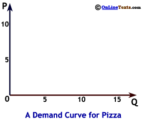
For example, we plot point A by drawing a horizontal line from 9 on the vertical axis and a vertical line from 2 on the horizontal axis. These lines intersect at point A. We follow the same procedure to plot points B through E.3 The demand curve is the downward sloping blue line labeled D passing through these points. We can also express this relationship with the simple equation:

