
13 This is another example of a graph of a level set.
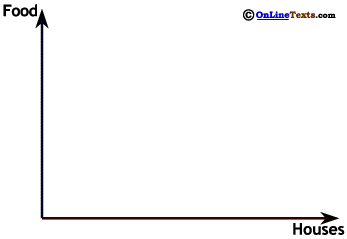
To the right is a graph of the possible amounts of food and housing that can be produced by some country when it uses all its resources.13 Later in this chapter in Section 7. Production Possibilities we will study these graphs in detail, where we will also learn the reason this line is curved out. For now we can see that this means that the amount of food that has to be given up to get more housing, or the amount of housing that has to be given up to get more food, is different at each point.
At point A the country can produce 90 Food units and 40 Houses. If the country wants to build an additional 55 Houses it can move to B, giving a total of 95 Houses. To do this, it only has to give up 20 Food units, for a total of 70 Food units. However, if the country moves from point B to point C, it has to give up an additional 45 Food units to be able to produce only an additional 45 Houses.
This concludes our introduction to economics diagrams. You may find it useful to return to this section from time to time to review this material as new graphs are introduced in the text.
13 This is another example of a graph of a level set.