
Click Here if you don't see topics listed to the left and below.

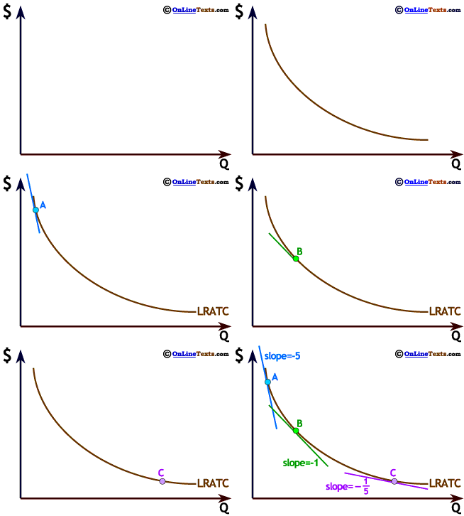
The graph to the right shows a negative, nonlinear relationship. As Q increases $ falls. This relationship is decreasing at a decreasing rate, so the curve becomes flatter as Q increases. This particular graph is the downward sloping portion of a Long Run Average Total Cost, LRATC, curve.
At point A the slope is -5 (it is negative because the graph slopes downward as we move to the right). As we move farther to the right, to point B, the graph is still downward sloping but the slope is only -1, while at point C the slope is only - 1/5.


Click Here if you don't see topics listed to the left and below.