
Click Here if you don't see topics listed to the left and below.

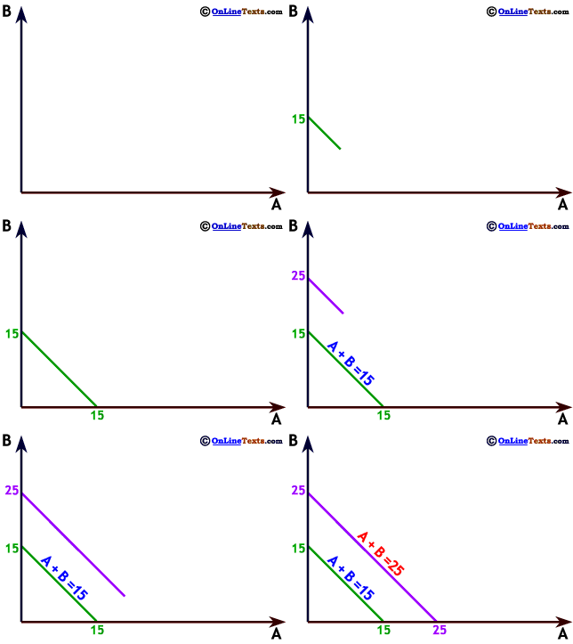
A graph that shows the set of points that generate some value is not a graph of a relationship between the two variables on the axes. For this reason, it makes sense that we can show combinations of our two variables that yield more than one value, as we have to the right. This graph shows the set of (positive) values of A and B that add up to 15, and a second line illustrating the set of values of A and B that sum to 25. Since these are simply sets of points that add up to certain values, both (and many more) can be correct at the same time.
In Chapter 4. Consumer Choice you'll see this kind of graph used to illustrate a consumer's Budget Constraint. A budget constraint shows all the combinations of two goods our consumer can buy with her income, very much like the graph to the right.


Click Here if you don't see topics listed to the left and below.