

Copyright © 1995-2004 OnLineTexts.com, Inc. - All Rights Reserved
 We learned that ATC = TC ÷ Q , so TC = ATC x Q. At any level of output, the height of the ATC curve is Average Total Cost for that level of output.
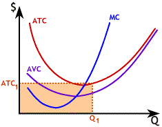
On the graph shown to the right, ATC1 is the Average Total Cost at Q1 so the shaded area is ATC1 x Q1 and represents the total cost of producing Q1 units of output.
ATC2 is the Average Total Cost at Q2 so the shaded area equal to ATC2 x Q2 represents the total cost of producing Q2 units
of output.
Copyright © 1995-2004 OnLineTexts.com, Inc. - All Rights Reserved