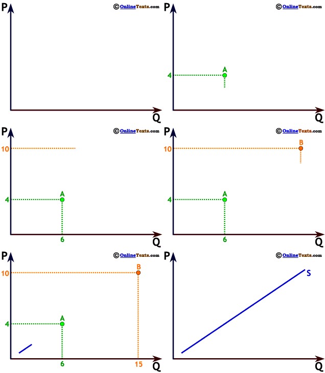


The graph to the right shows a positive linear relationship between two variables, P and Q. Values of P are shown on the vertical axis, and values of Q are shown on the horizontal axis. The relationship shown is called a positive relationship because larger values of P are associated with larger values of Q. Where P = 4 we can see that Q = 6 and when P = 10 we see that Q = 15. The relationship is termed linear because its graph is a straight line.
This particular graph is a graph of a supply curve,3 which is why it is labeled S. It shows the relationship between market price, P, and quantity supplied, Q.


3 Don't worry about understanding Supply curves at this point. For now, just be sure you understand the meaning of a positive linear relationship. Even though it's a straight line we call it a "curve" to remind us that sometimes Supply is not graphed with a straight line.


